

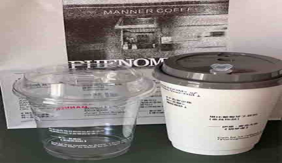
Introduction:The specialty coffee brand Manner has teamed up with a fashion magazine and an international design brand to launch a limited-edition collaborative cup, featuring literary quotes on high-quality takeaway packaging. In addition to the new “Tiramisu Latte,” the randomly printed themed cups featuring quotes from literary masters such as Borges have become a focal point on social media platforms. The hot and cold drink versions feature contrasting black-and-white designs, sparking a buying frenzy among consumers. This article analyzes the design ingenuity behind this literary-style packaging and offers practical purchasing advice and tips for checking store inventory.
Recently, Manner has collaborated with the fashion publication 《Yizhou Fantastic Man》 and the high-end design brand Thom Browne to release a seasonally limited “Tiramisu Latte” along with a matching canvas tote bag. However, what has sparked heated discussion among netizens is the set of collaborative cups that have transformed into artistic carriers — the cup designs subtly incorporate classic quotes from literary giants such as Borges and Ian McEwan. The hot drink version features a classic white background with black text layout, while the cold drink series uses a translucent bottle body to highlight white fonts, creating a distinct visual layering.
According to feedback from customers on-site, this designer-collaborated cup has successfully captured the attention of the literary youth demographic.Many regular customers made an exception and used takeaway cups, willing to pay an extra 5 yuan premium to purchase the cup-included combo, with some even stating: “I’ve gotten this same coffee to go for three days in a row just to collect the packaging.” Social media photos show that pairing it with the same series of minimalist paper bags can create a visual effect reminiscent of a fashion magazine cover.
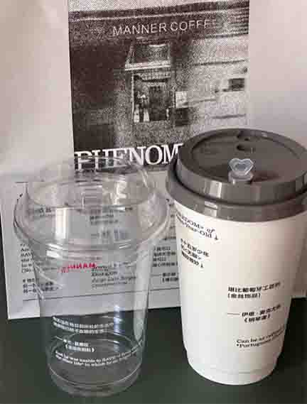
However, this upscale packaging has also garnered mixed reviews. Attentive customers noticed that the brand’s iconic inverted triangle logo has been reduced to a small font, hidden among the literary quotes, often leading to mistakes when ordering delivery. “Almost brought home someone else’s coffee when picking up the order,” “The minimalist design of the transparent cup body doesn’t make you think of Manner at all,” multiple consumers reported misunderstandings due to the overly subtle packaging. Additionally, some outlets experienced early sell-outs of the collaborative cup sleeves due to limited supply.
From a design perspective, this collaboration successfully elevates the coffee beverage to a lifestyle level.The bold white text on the hot drink cup contrasts sharply with the black background, making it ideal for capturing minimalist-style photos; the transparent material of the cold drink series clearly showcases the coffee color, with the white text adding a refreshing touch. Industry insiders point out that this packaging strategy not only strengthens brand recognition but also creates shareable social media talking points.
Regarding supply issues, Manner’s official channels have announced that they will accelerate the allocation of packaging materials and recommend that consumers call ahead to confirm store inventory. To improve the chances of getting the product, it’s advisable to visit less crowded locations on weekday mornings. For collectors, note that there are subtle differences between the hot and cold cup designs; special attention should be paid to version distinctions when aiming for a complete set.
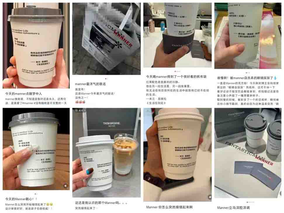
The above content is compiled by CoffeeHunters, a coffee news website.