






Introduction:Heytea recently made subtle adjustments to its brand logo once again, sparking heated discussions among netizens. From detailed changes to brand strategy, this update is not just a visual tweak but may also hint at the brand’s response to market trends. This article will delve into the specifics of Heytea’s logo changes, explore the possible brand intentions behind them, and share consumer feedback and opinions on the matter.
Heytea has once again made a nuanced adjustment to its brand logo, just over three months after the last redesign, quickly stirring up buzz on social media. Many netizens, after comparing the old and new logos, claimed they could hardly notice any differences. However, more observant users spotted numerous subtle changes—such as the ears, face shape, bangs, and facial features—and humorously described Heytea’s little boy character as having undergone “aesthetic micro-adjustments.”
From the early gold-lined little figure, to the classic “black-haired Hey,” and now to the latest round of fine-tuning, the frequent modifications to Heytea’s logo have sparked many speculations. Is this a return to the brand’s roots, an optimization to align with current aesthetic trends, or simply a well-planned marketing move to generate brand buzz?
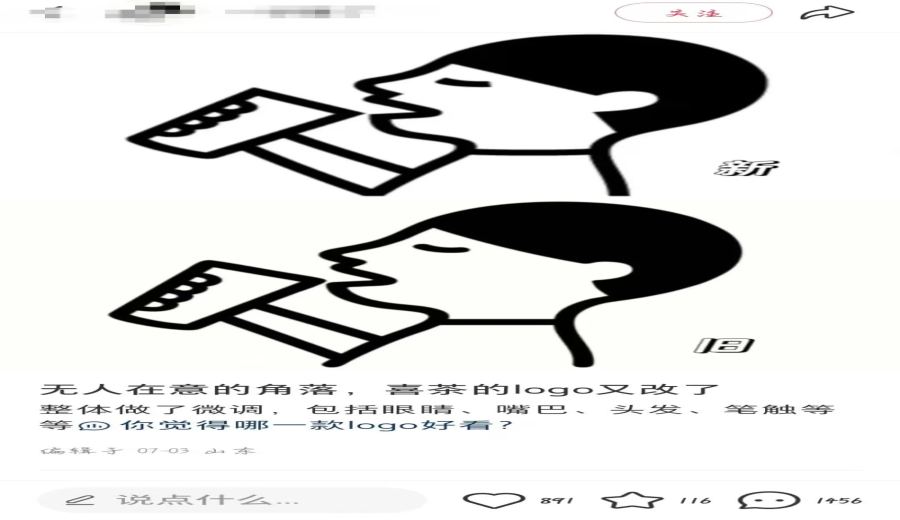
Recently, a post titled “In a corner no one notices, Heytea’s logo has changed again” gained widespread attention on social platforms. The poster displayed a side-by-side comparison of the old and new logos, but many netizens stared at the images for a long time yet still couldn’t identify what had changed about the little boy, filling the comments section with questions like “What’s different???”
However, some sharp-eyed netizens, through meticulous observation akin to using a magnifying glass, finally pinpointed the differences between the two versions of the logo: larger ears, a slightly smaller head, flatter bangs, a more prominent nose, a bigger mouth, squarer eyes, a greater tilt in the cup’s angle, disappearing arm lines, a shorter chin, and longer hair at the back of the head. One enthusiastic user even labeled each change individually, helping those who didn’t notice the differences to visually understand the boy’s facial tweaks, playfully comparing it to solving a “spot-the-difference” puzzle that required repeated scrutiny to spot the changes.
These minor alterations led many netizens to joke that Heytea’s little boy seemed to have gone through cosmetic surgery. “Feels like he’s got appearance anxiety—long eyelashes, high hairline, even elf ears,” one said. “Now he has an underbite,” another added. “They shortened his middle face and fixed his protruding mouth,” someone noted. “He got orthognathic surgery.” Of course, there were also those who felt the updated logo was more appealing. “The new one looks happier,” one commented. “The new character gives me more of a craving to drink it,” said another. “Feels like this version is more wholesome; the previous one made the drink seem less enjoyable.”
Notably, Heytea only changed its brand logo three months ago. According to online sources, Heytea previously used a gold-lined little figure logo until quietly introducing the classic “black-haired Hey” logo in March this year. Soon after, the official team made another minor adjustment to the boy’s image, leading many to speculate about the true intentions behind Heytea’s multiple logo revisions.
Regarding these changes, some users believe Heytea’s re-adoption of the classic logo may signal an official desire to return to its roots. Meanwhile, the fine-tuning of the classic character is seen as an effort to better align the image with current consumer aesthetics—“making the drink more prominent.”
Others speculate that the brand’s logo change might be driven purely by market strategy considerations and not as complex as outsiders imagine. There’s also a view that Heytea’s quiet modification of its logo, which then triggered public attention and boosted brand discussion, may actually be the official intent all along.
They pointed out that well-known brands like Xiaomi once stirred widespread online discussion with minor logo tweaks, and Heytea’s adjustments to its classic logo may have been made with similar intentions in mind. In fact, the “cosmetically enhanced Heytea character” indeed prompted netizens to spontaneously join in the “find the difference” discussion. To some onlookers, that may very well be the true significance behind the brand’s quiet rollout of the new logo.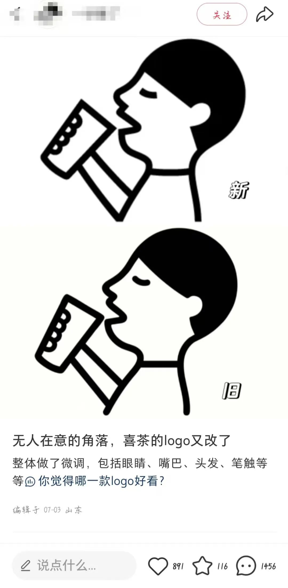
Overall, the subtle adjustments to Heytea’s logo are not merely design changes—they reflect the brand’s keen awareness of market trends and consumer psychology. Whether it’s about returning to its roots or catering to aesthetics, these small changes are quietly shaping the brand’s image and influencing how consumers perceive it.
The above content is compiled by CoffeeHunters, a coffee news website.