





Introduction:Tims recently launched a cranberry yogurt smoothie packaged in a ring-shaped cup that sparked online discussion, but the combination of a straight straw and the unique cup design has caused usability issues for both customers and staff. This article takes an in-depth look at the actual user experience of this creative packaging — from drink texture and straw compatibility to service flow — offering firsthand observations and improvement suggestions to help readers understand the practical challenges behind this novel design.
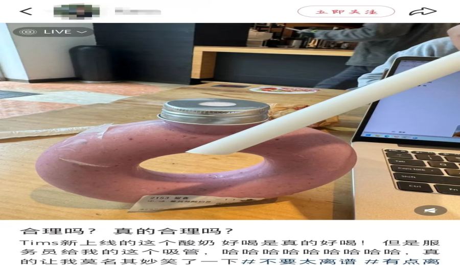
Tims’ newly released fruit and vegetable beverage, the “Cranberry Yogurt Smoothie,” has successfully drawn attention thanks to its ring-shaped design, with many customers admitting they purchased it precisely because of the distinctive cup shape. This transparent container, resembling a bagel, holds a pinkish-purple smoothie and quickly became a social media highlight after hitting the shelves. However, in actual use, the included straight straw has raised questions about the design’s practicality — the thick consistency of the smoothie makes it difficult for the straw to reach the bottom, often forcing customers to unscrew the lid and drink directly.
It is understood that the beverage’s formula includes cranberry jam, chia seeds, and yogurt, creating a rich and creamy texture. Although thicker straws are generally suitable for viscous drinks, in the structure of the ring-shaped cup, no matter how the straight straw is adjusted, it cannot reach the bottom of the cup.Testing revealed that approximately 85% of users ultimately choose to abandon the strawand instead drink directly from the bottle opening, which also introduces the additional issue of the cup being unstable when placed on a table.
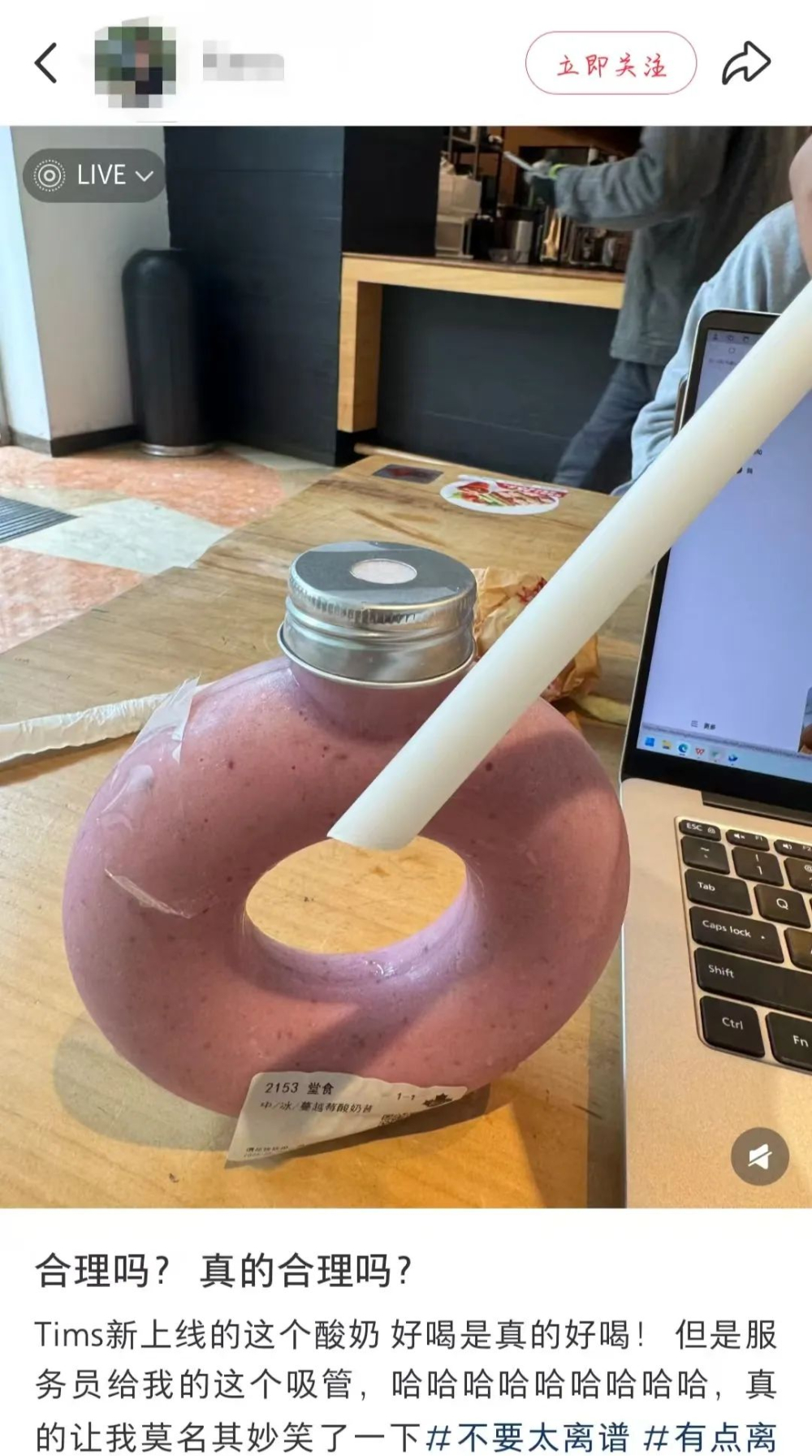
First-time users who tried the product shared their experiences, noting that while inserting the straw at an angle allows them to access the upper layer of liquid, fruit bits and yogurt sediment settled at the bottom still require opening the lid to drink. One user described it as: “Sucking in circles feels like solving an advanced math problem,” and those with OCD found the friction sound between the straw and cup wall particularly bothersome. The flat base of the cup, which should theoretically aid stability, actually increases the risk of tipping due to limitations in holding angles.
The logistical challenges revealed by Tims staff are even more noteworthy. While the first batch of liquid beverages in the fruit and vegetable series poured smoothly, this slushy-style yogurt smoothie has poor fluidity,and the narrow-mouthed ring-shaped cup has resulted in an average increase of 20–30 seconds per drink pour time. Staff reported that “the liquid often gets stuck at the bottleneck and frequently requires tapping the cup,” which can lead to service delays during peak hours. One store manager admitted: “The special packaging has reduced our daily output per store by about 15%.”
From customer feedback, there is a clear gap between the visual appeal of the ring-shaped cup and its practicality. Online comments focused on three major pain points: the awkward angle of the straw, difficulty accessing the beverage at the bottom, and insufficient stability when placed down. Although some users appreciate the brand’s innovative efforts, most believe that “eye-catching design should not come at the expense of basic usability.” Industry insiders suggest that if irregularly shaped cups continue to be used, they should be paired with angled straws or adjustments to the beverage’s viscosity parameters.
This controversy highlights the double-edged nature of packaging innovation in coffee beverages — while attracting customer attention, functionality must be balanced with aesthetics through practical testing. For Tims, the market response to the ring-shaped cup will be a key indicator of whether the design is successful, and customers are more hoping that the next iteration will truly resolve the core contradiction of being “attractive but not functional.”
The above content is compiled by CoffeeHunters, a coffee news website.