




Introduction:Heytea’s recently launched cold drink cups in silver-gray décor, while elevating the visual appeal in photos, have caused confusion among both customers and staff. This article delves into how the new cup design can obscure whipped cream lines, lead to mistaken assumptions of spoilage, and create practical inconveniences in use, offering beverage businesses insights on balancing aesthetics with functionality in packaging design.
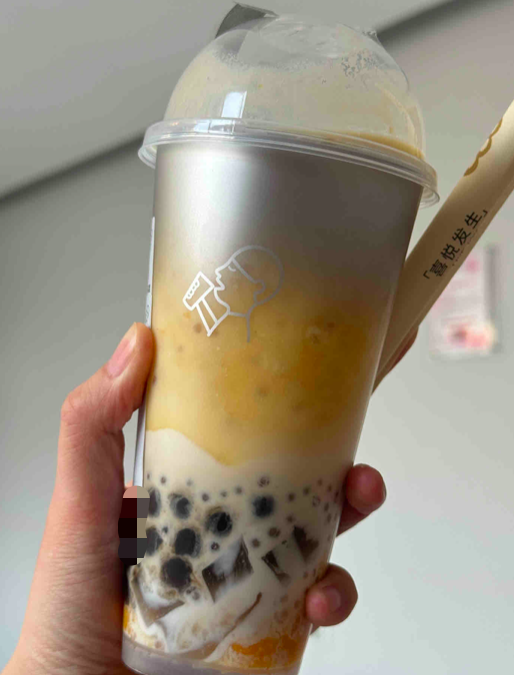
Heytea has recently updated its transparent plastic cold drink cups by adding a silver-gray decorative coating to the top, along with changing the brand logo to the same color scheme. While this adjustment gives drinks a more premium, layered look in photos, it has unexpectedly sparked a series of usage controversies.
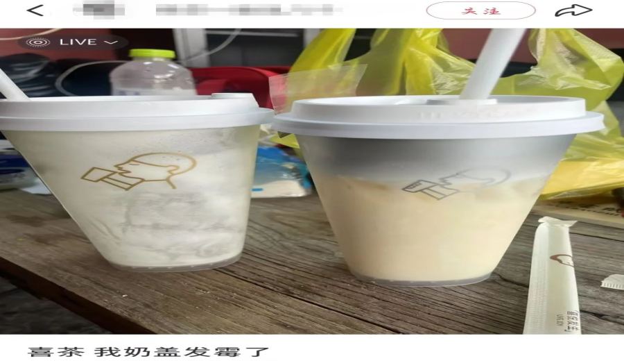
Some customers reported that upon receiving their drinks, they noticed a light gray layer on top of the whipped cream, mistakenly believing the product had gone moldy. In reality, this grayish area comes from the new decorative coating at the top of the cup, not an issue with the drink itself. Such misunderstandings highlight the potential for misleading visual communication in the new design.
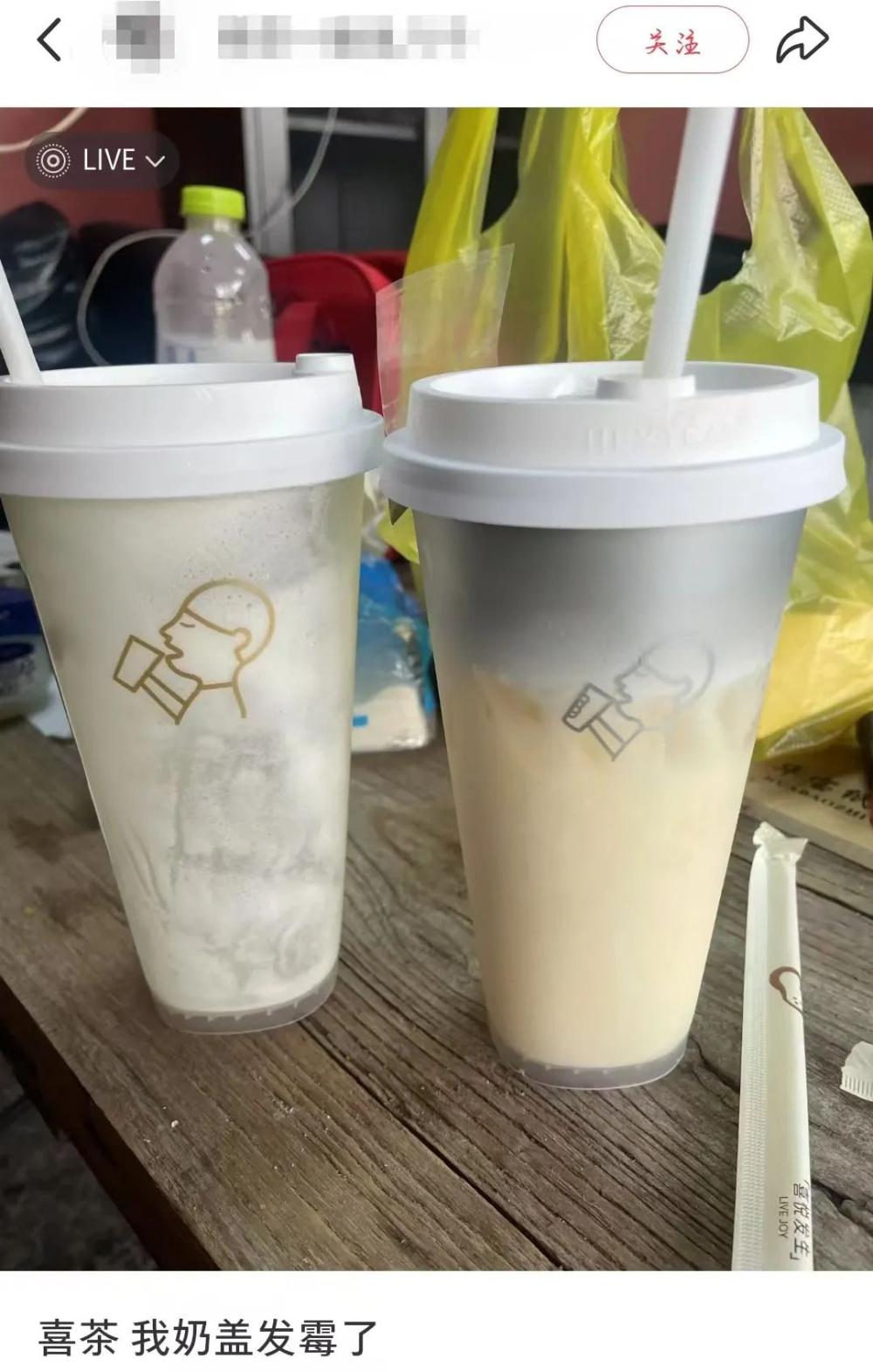
For customers who prefer whipped cream, the new silver-gray coating coincidentally overlaps with the area where the whipped cream sits, making it difficult to judge the actual amount added from the outside. Some customers worry that if the shop does not add the standard amount of whipped cream, consumers might fail to notice due to the visual obstruction.
Online discussions also pointed out that while the silver finish has a modern feel, it can easily be associated with non-food-grade materials or signs of spoilage—especially when paired with certain drinks, potentially reinforcing the illusion of “visual abnormality.” These observations remind brands that in pursuing design innovation, they must also consider consumers’ intuitive judgment habits.
On a practical level, Heytea staff face more direct challenges. According to frontline feedback, the new silver-gray coating obscures the original white water level and whipped cream indicator lines on the cup, making them hard to read. Multiple employees mentioned issues such as “difficulty identifying the cheese line” and “transparent lines being blocked,” affecting the accuracy of manually adding whipped cream.
Although the current production process has adopted machine-based quantitative technology, the top layer of whipped cream still relies on manual estimation. Under these circumstances, the clarity of the indicator lines directly impacts the consistency of the final product. The new cup design enhances aesthetic appeal but inadvertently increases the operational burden on frontline staff.
It is worth noting that Heytea previously launched a limited-edition silver-plated cup that received positive market feedback. The current across-the-board replacement of cold drink cups may continue that design philosophy. However, real-world application shows that a one-dimensional aesthetic upgrade, without incorporating user experience testing, can lead to unexpected operational issues.
Overall, this case highlights the need for beverage packaging design to balance visual appeal with practical functionality. It is recommended that businesses, when introducing new designs, consider not only consumer photography needs and brand image but also incorporate real usage scenario testing to ensure that label clarity and operational convenience remain unaffected.
The above content is compiled by CoffeeHunters, a coffee news website.