







Introduction:Recently, the tea beverage brand GuMing launched a new flavor "Two Fresh Stewed Pears," packaged in a specially designed lidded bowl-style takeaway cup. The combination of its brownish lid and white straw was jokingly compared by netizens to a "toilet plunger," sparking widespread discussion. Beyond scrutinizing whether the packaging design is appropriate, consumers have also reflected on the balance between the appearance and practicality of beverages. This article will delve into the design rationale, user feedback, and market response behind this packaging controversy, helping readers understand the trade-offs the tea beverage industry faces between packaging innovation and consumer experience.
In recent years, the tea beverage market has become highly competitive. In addition to continuously innovating flavors, major brands are also placing increasing emphasis on the creativity and buzzworthiness of their packaging designs. Recently, the well-known tea beverage brand GuMing launched a limited-edition new flavor, "Two Fresh Stewed Pears," in select regions. Made by slow-simmering six natural ingredients such as white fungus, fragrant pears, and red dates, the drink is positioned as nourishing and health-promoting, attracting many health-conscious consumers eager to try something new.
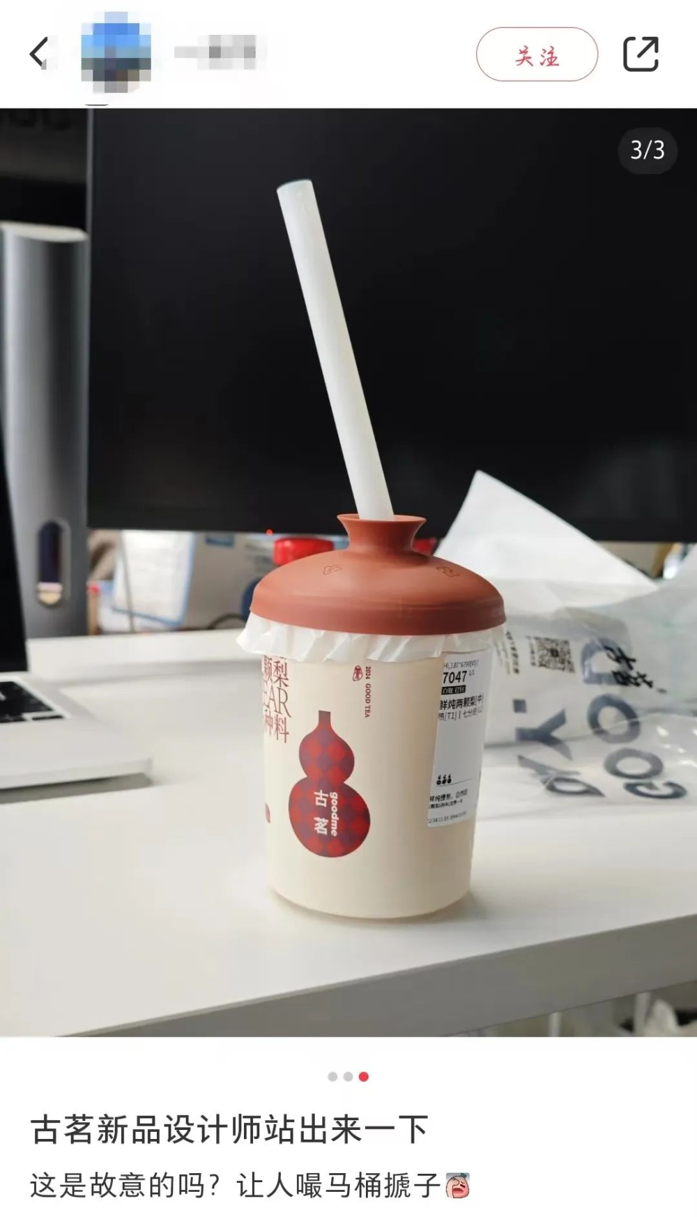
However, more than the drink’s contents, what stirred online discussion was the specially designed lidded bowl-style takeaway cup that came with it. According to multiple consumers sharing on social media platforms, the cup lid features a warm brownish hue and mimics the shape of a traditional teacup lid. When paired with a white straw, the overall look bears a striking resemblance to the commonly seen "toilet plunger," prompting extensive commentary and jokes.
A social media post titled "Designers of GuMing’s New Product, Please Step Forward" quickly went viral. The poster explained that they had originally just bought the new flavor out of curiosity, but upon seeing the specially designed cup lid, they found it increasingly odd and couldn’t help but question the design intent. Netizens responded in kind, saying things like "I didn’t notice at first, but now that you mention it, it really does look like one," and even joked that "it tried to go for an elegant vibe but ended up as a comedy bit."
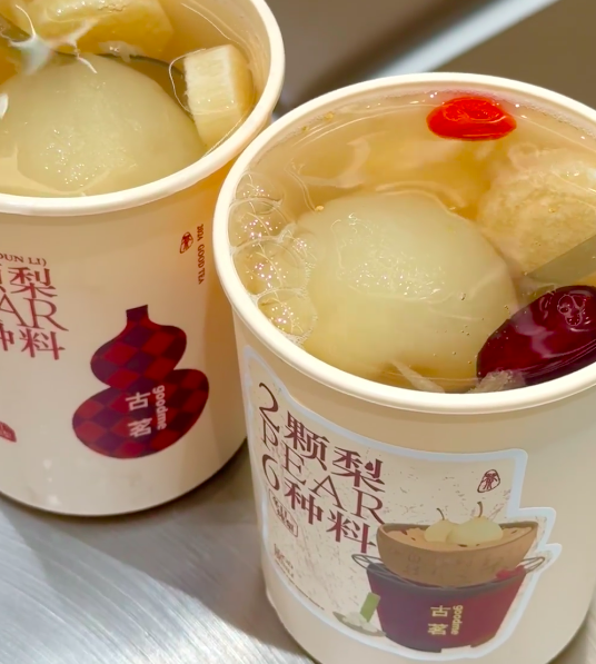
In fact, it is believed that the design of the cup lid was inspired by traditional Chinese lidded bowls used for tea. The brownish lid carries a sense of traditional aesthetics, but compared to the commonly used clear or light-colored straws, GuMing opted for a white straw. The overall visual effect reminded many of cleaning tools. Some netizens analyzed that if the lid had been in a different color scheme—such as the green lidded bowl cup previously launched by Nayuki—it might have avoided such associations.
Notably, this is not the first time the tea beverage industry has adopted a lidded bowl-style cup lid. Previously, several brands, including Nayuki, had also launched similar designs, but none triggered such an extreme reaction. Industry insiders pointed out that packaging design not only needs to focus on visual appeal, but must also consider the public’s everyday perceptions and emotional associations to avoid misunderstandings caused by color and shape combinations.
In addition to the controversy over the packaging’s appearance, some consumers also reported that they were unaware the top of the lid was actually the straw opening. They initially thought they would have to open the entire lid to drink, which led to spills or inconvenience when sipping after opening. One user admitted, "I thought I had to open the lid to drink and ended up staining my clothes," while another said, "I didn’t know you could just insert the straw—had no idea before." This highlights that product design, beyond innovation, also needs to take into account user intuition and ease of use.
In response to this incident, many netizens expressed that although innovative packaging can attract attention, neglecting basic usability and visual associations may backfire. When designing distinctive cup styles, brands should not only emphasize the uniqueness of the appearance but also evaluate whether it might trigger negative associations. It's crucial to ensure consumers can intuitively use the product, avoiding misunderstandings that could harm the overall brand image.
In summary, although GuMing’s lidded bowl-style takeaway cup sparked visual controversy, it also drew more consumer attention to the intention and details behind tea beverage packaging design. For the industry, finding the right balance between innovation and practicality, as well as aesthetics and acceptance, will be a key challenge in future design. At the same time, this incident serves as a reminder that brands, when introducing new designs, should communicate usage methods and design concepts more effectively to better enhance consumer satisfaction.
The above content is compiled by CoffeeHunters, a coffee news website.