







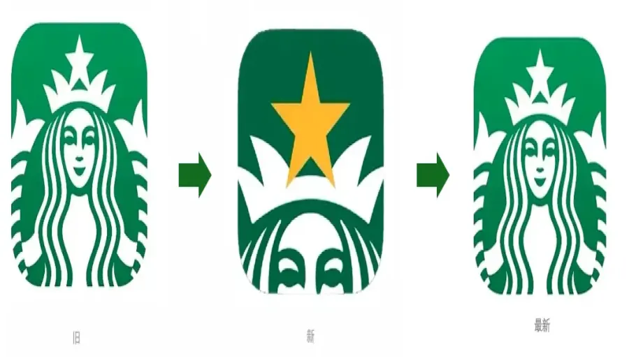
Introduction:Starbucks recently changed its app icon back to the classic twin-tailed siren image, replacing the controversial close-up half-face mermaid design that had sparked widespread discussion. This change has not only generated extensive user conversation but also raised questions about whether it is related to the recently concluded Diamond Member event. This article will delve into the background and impact of the logo change, as well as how brand visual adjustments affect user experience.
The Starbucks app icon has undergone a notable change recently — the company quietly replaced the previously controversial close-up half-face mermaid new logo with the familiar classic twin-tailed siren image. This move brought relief to many users, and some have also begun to speculate whether it is related to the just-concluded Diamond Member upgrade campaign.
Looking back at this new logo, it was quietly launched last month. The design significantly zooms in, showing only half of the mermaid’s face, with particular emphasis on the yellow five-pointed star on her head. The original intention of this design was to align with Starbucks’ “Starbucks Rewards” membership program, highlighting the theme of earning and redeeming stars. However, as soon as the new icon was launched, it received a wave of negative feedback on social platforms. Many users called it “ugly” or “sneaky,” with some even mistaking it for a pirated app.
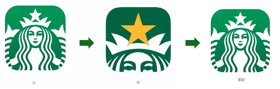
Compared to the classic full-body mermaid design, the new one is indeed much bolder. The previously rounded and complete siren image has been replaced by a half-face wearing a crown, with the visual focus entirely on the yellow five-pointed star, which occupies about half of the logo’s area. In terms of color, it has shifted from the usual grass green to a combination of gold and dark green, aiming to make the yellow more eye-catching and emphasize the concept of a “full star upgrade.”
However, although this change may have had strategic considerations in brand visuals, it clearly did not win the approval of the majority of users. Many fans expressed online that the new icon looks like the mermaid is “spying” on users. Some even took inspiration from it to create a series of humorous meme images, such as “Observing Secretly,” “Let Me See Who’s Drinking Luckin,” and “Sneaky Business,” humorously conveying their frustration and satire toward the new logo.
Faced with an overwhelming wave of negative feedback, Starbucks quickly made adjustments and has recently reverted the app icon back to the classic twin-tailed siren. An internal employee revealed that the main reason for this change was the conclusion of the one-month Diamond Member upgrade campaign, prompting the official decision to restore the original logo in order to maintain brand consistency and user familiarity.
Notably, during the period when the new logo was in use, many consumers reported to store staff that they felt uncomfortable with the new icon, even suspecting they had downloaded a fake app, and went to stores specifically to ask staff for confirmation. Many netizens also went directly to the App Store to give Starbucks a one-star rating, expressing dissatisfaction with the new design.
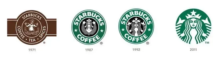
From a brand management perspective, this logo controversy reflects how companies balance innovation and user sentiment when making visual adjustments. Although Starbucks attempted to reinforce the theme and visual focus of the membership campaign through the new icon, the eventual return to the classic design shows a respect for user feedback.
With the return of the classic logo, many users have expressed their approval on social media, even jokingly saying, “It’s good to know how to correct mistakes.” This incident also serves as a reminder to major brands that, in updating their image, in addition to considering market strategy, they must also take into account consumer emotions and sense of identity.
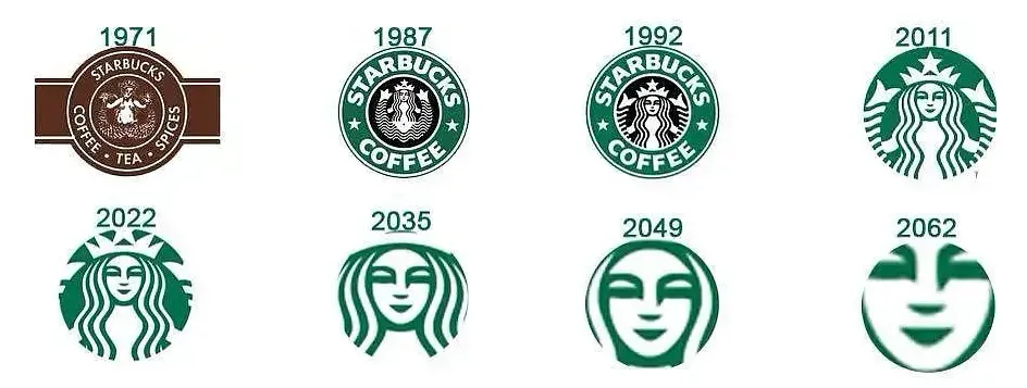
In summary, although the Starbucks logo change was brief, it sparked considerable discussion and showed the brand’s responsiveness to user feedback. Whether Starbucks will become more cautious in future brand image adjustments is something worth keeping an eye on.
The above content is compiled by CoffeeHunters, a coffee news website.