







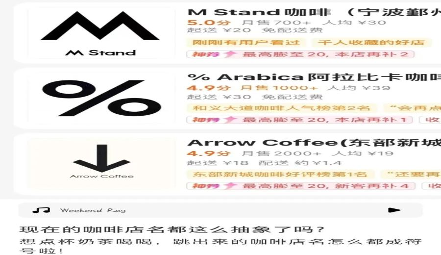
Introduction:In recent years, coffee shop logos have embraced a minimalist symbol trend—from %Arabica’s percent sign to the black-and-white punctuation patterns seen on nearly every street corner. Though these designs may appear simple, they carry hidden intricacies. Why are so many brands adopting this style? Is it to highlight individuality or simply to follow the trend? This article will dissect the design logic behind these symbols and analyze how they influence consumer memory, while also providing practical tips for recognizing them.
When browsing coffee shops on delivery platforms, one often encounters a sea of abstract symbols on white backgrounds with black text, leaving people puzzled about how to even pronounce the shop names. This minimalist symbol trend, represented by %Arabica and M Stand, draws inspiration from keyboard punctuation and mathematical symbols—just place a comma, question mark, multiplication sign, or even the mathematical constant π against a plain white background, bold it, and you’ve got what looks like a professional brand emblem.
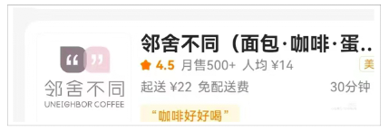
User tests have found that these symbols are not just confined to virtual designs but are also actually used on physical store signs.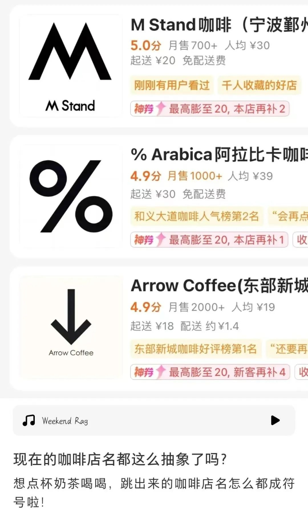 Commonly used punctuation such as commas, question marks, quotation marks, paired with up and down arrows, or mathematical symbols like multiplication signs, approximately equal signs, the mathematical constant π, and even the "Fang family" of square and cube symbols, all become design elements.
 Even more unique are symbols like the infinity sign ∞, the empty set from set theory, and the special characters # and * found on phone keypads.

 。
Some of these symbol combinations can be intuitively associated with coffee, while others are so abstract that they’re hard to decipher. Beyond single symbols, combinations of geometric shapes are also commonly seen in brand design. Netizens jokingly refer to this phenomenon as a “keyboard creativity competition,” given that the richness of Greek letters and advanced mathematical symbols is enough to support the creation of dozens of coffee shops with vastly different styles.
The original intent behind minimalist symbol logos is to convey a brand’s spirit through simple composition. Take %Arabica’s “%” as an example—its black-and-white contrast and unique shape successfully establish brand recognition; M Stand’s “M” reinforces memorability through its minimalist lines. Such designs typically adhere to three principles: concentrated visual focus, subtle cultural meaning, and ease of scaling down for use on various packaging materials.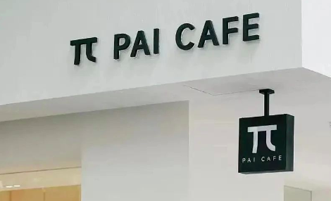 。
However, blindly following the trend can backfire. Some brands merely imitate the black-and-white minimalist look without endowing the symbols with cultural depth, earning criticism for being “a poor imitation.” A more practical issue is that overly obscure symbols (like special mathematical ones) can create communication barriers—consumers often have to make up “new store names” just to describe them to others.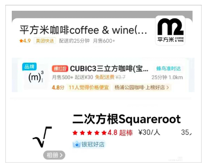 Designers advise that effective symbols should balance uniqueness with communicability—for instance, by hiding the outline of a coffee cup in negative space or subtly incorporating details like the latitude and longitude of the origin within the strokes.
For consumers, identifying these symbols can be approached in three ways: observing the symbol’s connection to coffee (such as a droplet shape), paying attention to the cultural codes of the brand’s origin (Japanese brands often favor minimalism), or directly looking up the design philosophy in the brand’s story. Additionally, the material choices used in physical store signs (such as metal cutouts or ceramic firing) often enhance the three-dimensional impression of the symbol, compensating for the limitations of flat design.
The above content is compiled by CoffeeHunters, a coffee news website.