







Introduction:Starbucks has long been known for its classic brown paper bags and green logo, and rarely followed the mainstream trend of "trio" collaborations. However, during the Lunar New Year of the Dragon, the brand unexpectedly launched three specially designed limited-edition dragon-themed cup sleeves, sparking widespread market discussion. This move is seen as a key attempt by Starbucks to localize its brand, especially under the strategy of maintaining stable pricing and accelerating store expansion in lower-tier cities. Through packaging innovation to attract consumers, it has become a new focal point. This article analyzes the background, market response, and strategic significance of this design shift.
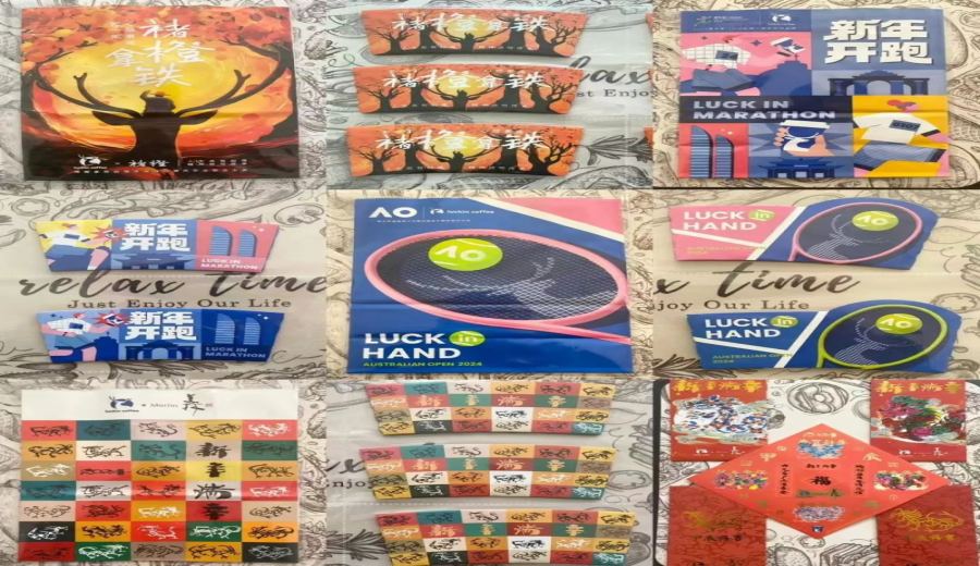
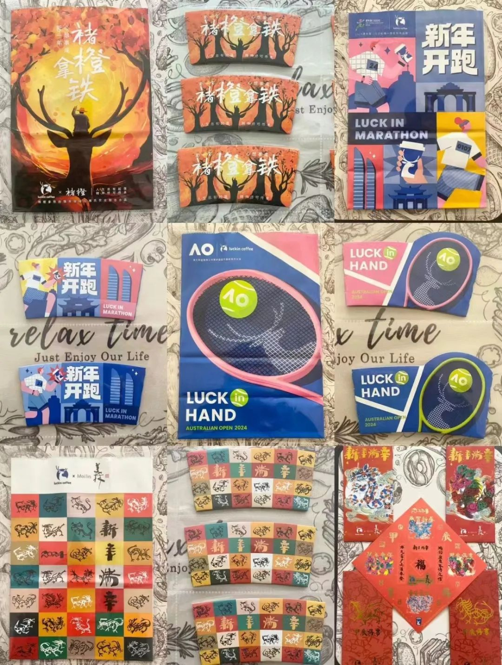
In the chain coffee market, collaboration campaigns have almost become a standard tactic for brands to generate buzz, and the classic "trio" of "limited-edition cup sleeves, stickers, and paper bags" has become a staple for many brands to attract consumers. For example, when Luckin collaborates with various popular IPs, it not only launches themed drinks but also simultaneously releases limited-edition cup sleeves, stickers, and paper bags—even for themes like the Australian Open, which are less compatible with stickers, the cup sleeves and paper bags are still designed.
Although these accessories have low production costs and are easy to implement, they significantly enhance the sense of ritual in purchasing, and consumer acceptance is generally very high. Over time, this has created a market expectation—that collaborations should come with complete merchandise. However, Starbucks has long seemed uninterested, not only rarely participating in such "internal competition" but even when there are collaboration activities, it often only releases limited-edition merchandise with low-key promotion. If fans don’t actively follow official updates, many may not even know the brand has launched new collaborations.
Starbucks’ signature brown paper bags and green logo have successfully established high brand recognition, but externally, this "unchanging for a decade" style is seen as an obstacle to promoting collaboration campaigns. Take the early-year collaboration with *Havoc in Heaven* as an example—despite high market expectations, many consumers complained about the lack of physical merchandise like cup sleeves, which significantly diminished the overall collaboration effect, leading to it being dubbed an "ineffective collaboration."
However, during the Lunar New Year of the Dragon, Starbucks finally made a move. Alongside the launch of dragon-themed limited-edition drinks, the brand also introduced three specially designed dragon-themed limited-edition cup sleeves in stores, a change that immediately sparked consumer discussion. Many long-time customers exclaimed, "Starbucks is making a decision that goes against its ancestors," or "Finally taking this step—otherwise, we wouldn’t even know what we’re drinking," showing high market attention to the brand’s change.
According to Starbucks’ Q1 2024 financial report, Wang Jingying, Chairman and CEO of Starbucks China, stated that the brand will accelerate its store expansion in lower-tier cities this year, actively laying out markets in second- and third-tier cities, but also made it clear that it would not join the price war. Under these premises, to both expand market coverage and maintain its premium positioning, Starbucks chose to enhance brand affinity through packaging design that resonates more with local culture—and the dragon-themed limited-edition cup sleeves may be the initial practice of this strategy.
However, this change did not receive unanimous praise.Some consumers felt the new cup sleeve designs were vibrant and eye-catching, symbolizing good fortune, showcasing positive expectations for the future, and were exquisitely crafted, enhancing the purchasing experience;but some netizens pointed out that the dragon patterns on the cup sleeves appeared to be influenced by Japanese illustration styles, lacking the essence of traditional Chinese dragon motifs, and even gave off a sense of a "Western evil dragon," believing there is still room for improvement in the design details.
Overall, Starbucks, which has always followed a premium route and rarely joined the trend of collaboration merchandise, choosing to release limited-edition cup sleeves this time is undoubtedly a strategic adjustment and experiment. Although the design style is subjective, the brand’s willingness to break away from its "unchanging for a decade" inertia has already earned it greater tolerance from many consumers, who look forward to seeing more innovation and localization in other packaging elements, such as paper bags, in the future.
The above content is compiled by CoffeeHunters, a coffee news website.