



Introduction:Starbucks has recently revamped the packaging design of 13 classic coffee bean blends across the board, with the first five new designs making their debut on August 29. The new packaging features vibrant colors and hand-drawn illustrations that incorporate regional culture and the stories of farmers, breaking away from its previously monotonous style. This article takes an in-depth look at the new visual designs of five blends including Idlewild Blend and Pike Place, revealing the regional characteristics and flavor inspirations behind them, while also exploring how this transformation strengthens the connection between consumers and coffee origins.
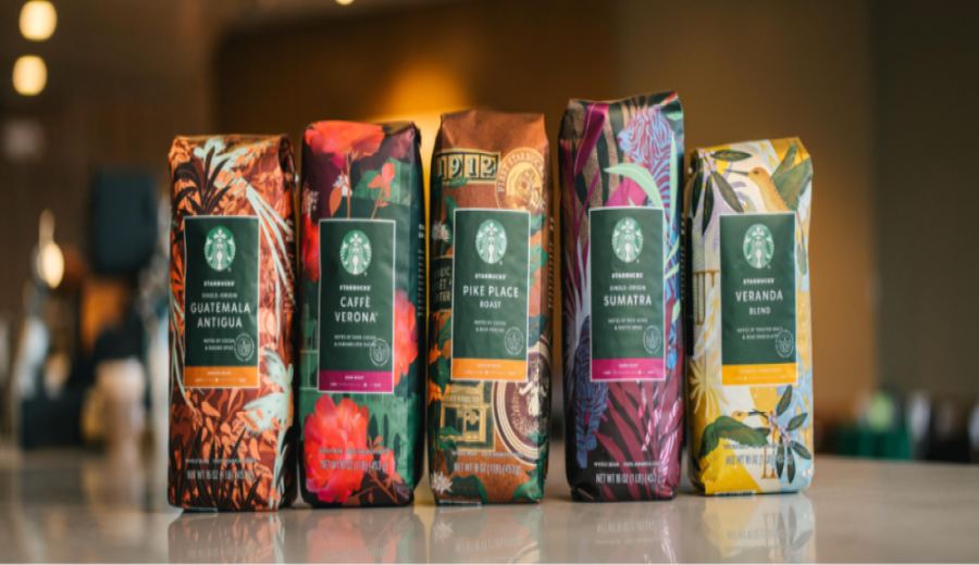
Starbucks recently announced a comprehensive redesign of the packaging for 13 of its regular coffee bean blends, with the first five new designs unveiled on August 29. This innovation breaks away from the traditional single-color scheme, instead adopting a riot of colors paired with hand-drawn illustrations that cleverly integrate the unique culture, native plants, and backstories of coffee farmers of each origin. It provides more engaging storytelling material for Starbucks partners familiar with CT (coffee tasting sharing).
Over the past decade, many baristas have advised newcomers preparing CT topics to start with the packaging graphics and stories of the 13 regular blends to find inspiration that ties into the theme and reflects Starbucks’ culture. However, over time, these packaging narratives gradually became formulaic, struggling to spark deeper consumer interest. This redesign aims to fill that gap by using visual language to strengthen the brand’s connection with sustainability.
The new packaging designs continue Starbucks’ tradition of using art to tell stories, employing rich colors and local elements to resonate with consumers. The design team evokes the terroir and the dedication of growers by depicting cultural symbols, plants, and colors unique to coffee-producing regions, allowing customers to intuitively sense the spirit of the place and the care of the producers as they make their selections.
The first batch of newly revealed packaging covers five classic blends: the Idlewild Blend and Pike Place, both medium-roasted, the Guatemala Antigua, also medium-roasted, the Caffe Verona, dark-roasted, and the Sumatra, also dark-roasted. Each one uses a distinct visual vocabulary to interpret the unique characteristics and soul of its origin's flavors.
The Idlewild Blend (Veranda Blend) is a light-roasted bean from the Latin America region, and its packaging draws inspiration from the common courtyards and balconies found there, symbolizing the warm atmosphere of the third space. The design weaves together hummingbirds, balcony railings, coffee cherries, and flowers, accented by vibrant color blocks, conveying the passionate spirit of Latin American coffee farmers and the region’s rich natural environment.
The Pike Place (Pike Place) is a medium-roasted bean from the Latin America region, named after the location of Starbucks’ first store. The new design incorporates the original logo, store imagery, and travel stickers, along with elements of coffee tree leaves and cherries, emphasizing the brand’s heritage and commitment to sustainable coffee, ensuring customers can enjoy a consistent quality experience anytime.
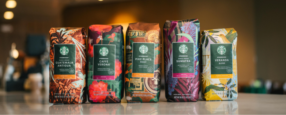
The Guatemala Antigua comes from the country’s eponymous single-origin region, where coffee is a source of family pride. The new packaging continues the motif of the national bird, the resplendent quetzal—a species endangered—calling for environmental awareness, and adds various local plant elements. The copper-toned palette complements the medium roast flavors.
The Caffe Verona coffee was originally a custom blend for restaurants and is well-suited for making Irish coffee. The new packaging retains the classic rose pattern and adds decorations such as castles, fountains, and vines to enhance the romantic ambiance, giving the rich dark chocolate and caramel flavors an even more atmospheric touch.
The Sumatra (Sumatra), commonly known as Mandheling coffee, retains the highly recognizable tiger emblem on its original packaging. The new version adjusts the proportion of the tiger and palm trees, using texture and layered colors to deepen the mysterious feel of the jungle, inviting drinkers to go beyond the bold impression and explore more nuanced flavors.
This wave of packaging updates showcases Starbucks’ strategic shift to attract a new generation of consumers. Since Howard Schultz’s return, the brand has actively incorporated design elements favored by younger audiences, no longer limiting itself to its classic image, demonstrating a keen insight into market trends.
The above content is compiled by CoffeeHunters, a coffee news website.