





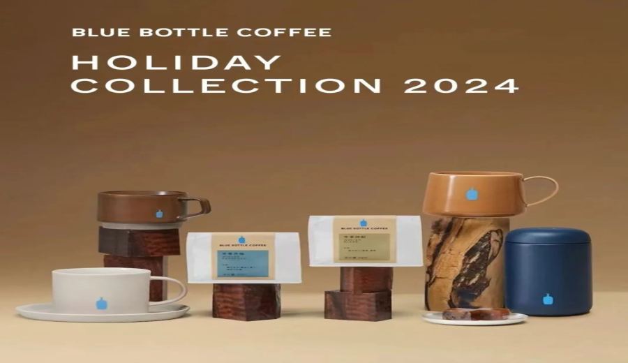
Introduction:After the release of Blue Bottle Coffee’s 2024 Japan holiday-themed merchandise, many consumers reported a noticeable color discrepancy between the actual mugs and their promotional images, leading to a wave of returns. This article delves into the causes of the color differences in the Caramel Chigasaki Cup and the Kinto ceramic mug, examines quality control issues, and provides practical purchasing advice along with real case references to help consumers avoid the “color difference trap.”
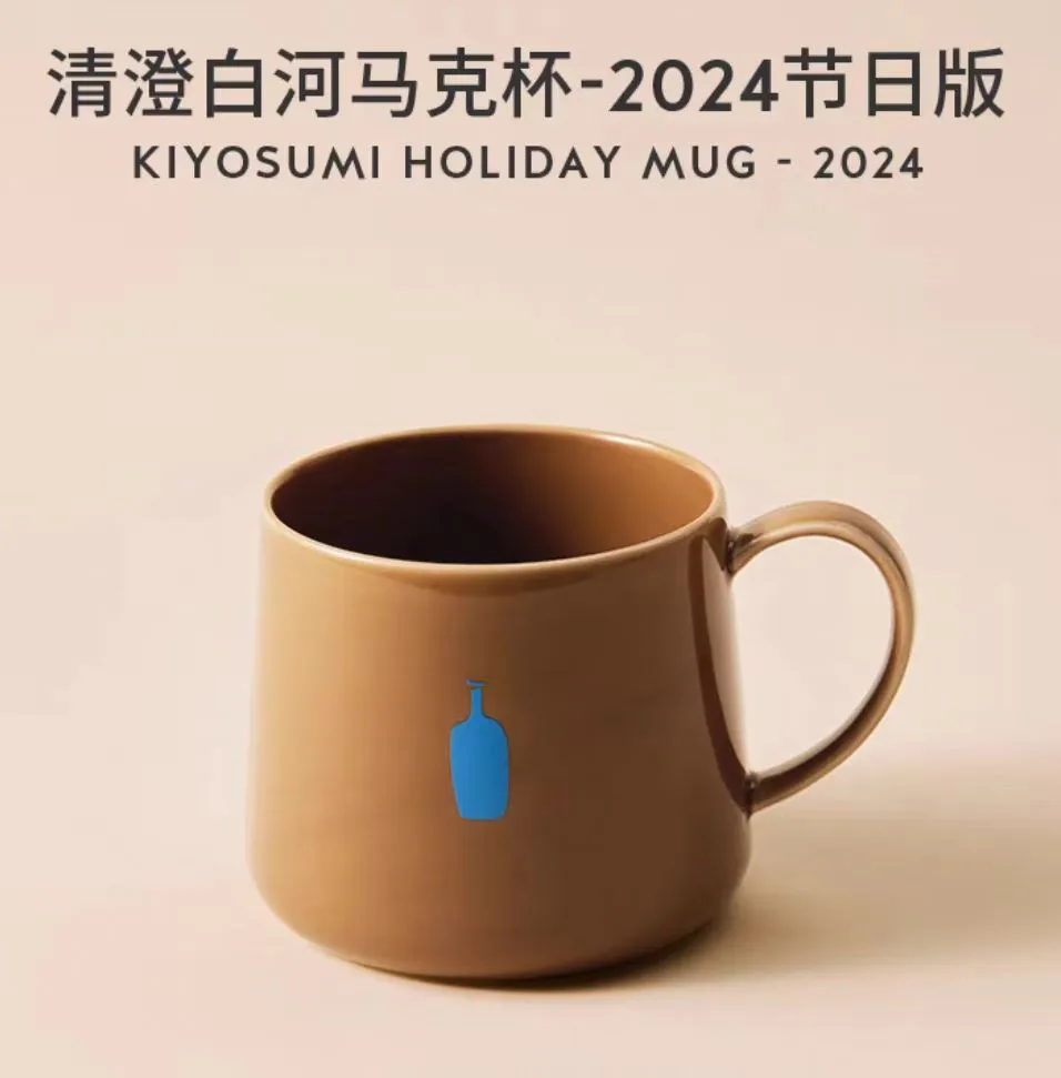
Every year at the end of the year, Blue Bottle Coffee (Blue Bottle Coffee) releases holiday-themed merchandise in Japan. This year’s theme, “Delicious Gifts,” included several winter-exclusive items such as the Caramel Chigasaki Cup and the deep caramel Kinto ceramic mug. However, after the products hit the market, many consumers found that the mugs they received had significant color differences compared to the official promotional images. The rich caramel color depicted in the promotions appeared much lighter and more muted, resembling a milky tea tone in reality, sparking dissatisfaction among many buyers.
In addition to the color discrepancy issue, some consumers also reported problems such as skewed logo printing on the cups, noticeable surface flaws, and even uneven glaze coloring. These quality control issues led many consumers who had hoped to collect the items to ultimately opt for returns, sparking heated discussions on social media platforms.
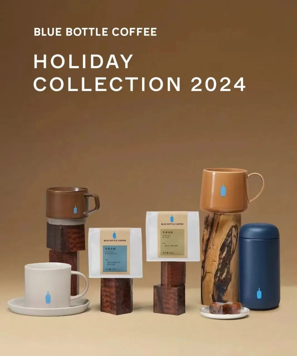
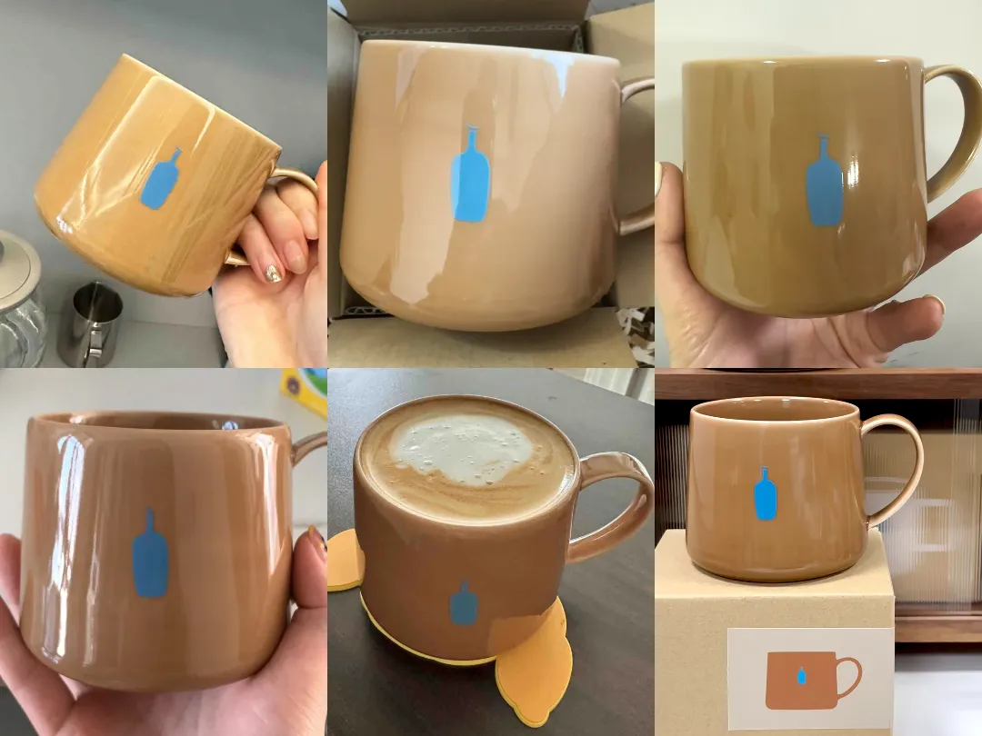
The official explanation pointed out that the color differences were mainly due to the use of a hand-glazing process, combined with variations in lighting during different photo shoots, resulting in a tonal gap between the promotional images and the actual products. In particular, the glaze formulation and chemical changes during the firing process of the Kinto ceramic mug and the Chigasaki Cup also affected the final color presentation. However, this explanation did not fully alleviate consumer concerns, especially when comparing the official images with actual unboxing photos, where the differences remained quite obvious.
In fact, such color discrepancy controversies are not new. As early as last year, Blue Bottle Coffee’s green-themed mugs also sparked discussions due to colors deviating from the promotional images. At that time, the brand responded that while the products sold in each market were consistent, some logos were adjusted according to local market regulations. This year, the brand has also added text reminders across all sales channels, stating that because the mugs are hand-glazed, the shade of each finished product may vary slightly, and advised consumers to rely on the actual item received.
Professional ceramic artisans pointed out that the mugs involved in this controversy used a special glazing technique called “Dobakake.” This technique results in varying glaze effects depending on the glaze concentration, application method, and temperature changes during kiln firing. As a result, even mugs from the same production batch may exhibit slight differences in color and gloss, which is part of the uniqueness of handmade ceramics—but also increases the likelihood of consumers receiving products with “more noticeable color differences.”
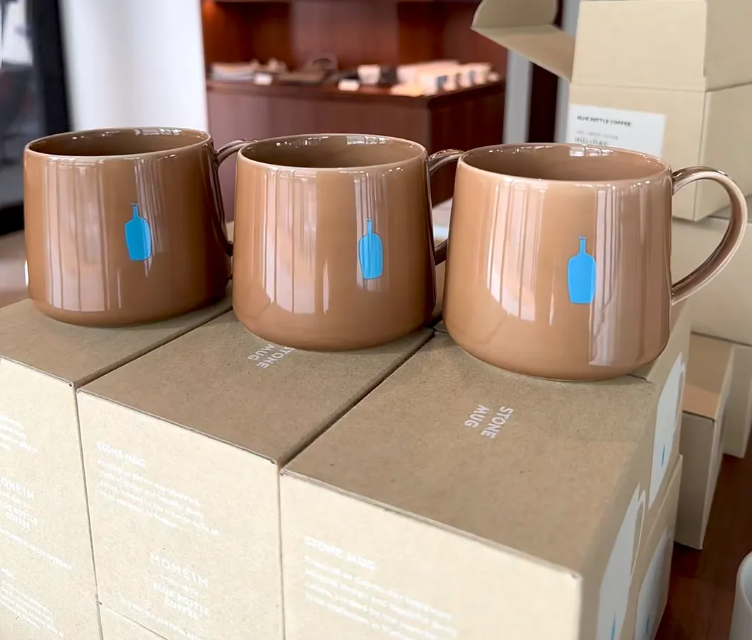
Beyond the color difference issue, consumers also reported that even when selecting items in physical stores, there were visible tonal differences between mugs of the same model, showing that even with in-person shopping, it’s hard to guarantee getting a product identical to the promotional image. Some netizens suggested that if color consistency is a high priority, it’s best to see the item in-store first or refer to more buyer-uploaded photos, rather than relying solely on official promotional materials when making a purchase decision.
For consumers looking to collect Blue Bottle Coffee’s limited-edition merchandise, it is recommended to familiarize yourself with the characteristics of handmade products and moderately adjust expectations for a “perfect appearance.” If you are particularly concerned about color consistency, you might also consider opting for other products from the brand that are not hand-glazed or have more stable coloring, reducing the gap caused by craftsmanship factors.
In summary, although Blue Bottle Coffee’s 2024 holiday-themed mugs maintain the brand’s signature minimalist aesthetic in design and theme, the gap between the actual product quality and promotional imagery still serves as a reminder for consumers to do their homework before purchasing—understanding the characteristics of handmade goods—to avoid having their shopping experience negatively affected by color discrepancies or quality control issues.
The above content is compiled by CoffeeHunters, a coffee news website.